My Role: Solo product designer — concept, research framing, IA, UI, design system, and testing plan.
The Team
None — this is a self-initiated concept project. Target users (monitoring center operators and security operations managers) are illustrative profiles built from publicly documented industry research, not original interviews. See "What's Real vs. Hypothesis " is low.
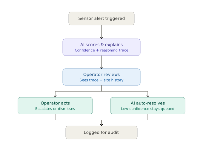
The Real Design Problem: The obvious fix for alarm fatigue is automatic triage — rank and even auto-resolve the alerts that are almost certainly nothing. But published research on alarm systems shows operators calibrate how much they trust an AI system based on how reliable they believe it to be. An AI that's right most of the time but explains nothing either gets ignored the first time it's wrong, or gets over-trusted in a way that lets a real threat slip through unquestioned.So Vigil's actual design problem isn't alert prioritization. It's building an interface that earns and keeps operator trust in an AI system, alert by alert, shift by shift..
What's Real vs. Hypothesis
I want to be upfront about this rather than let a polished prototype imply more validation than exists..
The two user profiles (operator and ops manager) are a reasonable starting hypothesis based on how the industry is publicly documented to work not a substitute for talking to real operators.
Before trusting them, the next step would be shadowing an actual monitoring shift, or at minimum running five to eight interviews with current or former alarm monitoring operators, asking specifically about a recent moment they distrusted or overrode an automated system.
The reasoning trace panel " the signature idea of this whole project " is my best design hypothesis for building trust. Only real operators can confirm whether it's the right amount of explanation, too much, or still not enough.
The goals and metrics below are what I'd want to measure, not results from a shipped product.
Goals and Success Metrics (hypothesized, not measured)
Reduction in average time to acknowledge a genuinely critical alert
Operator override rate on AI auto-resolved alerts, tracked over time a healthy system should see this stay low but never hit zero, since zero likely means operators stopped checking, not that the AI is perfect
Operator-reported trust in the system, gathered through a short survey, since trust is the entire design thesis here
Reduction in false alarms forwarded to on-site guards or police.
Information Architecture
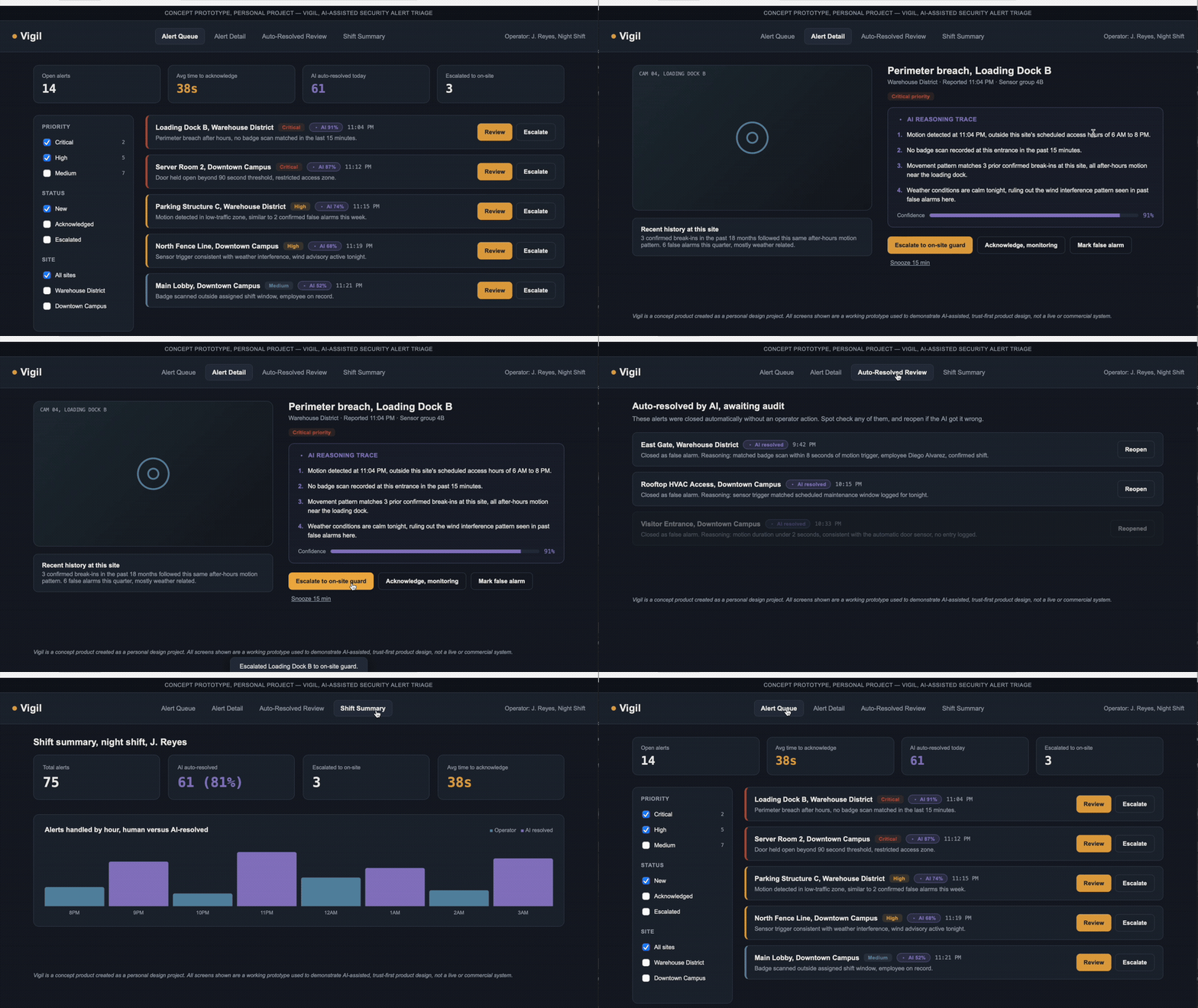
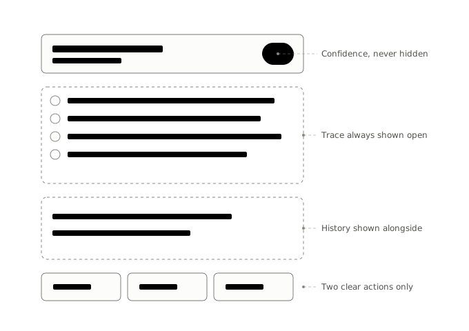
Alert Queue — the main working view, alerts sorted by AI-assigned priority, confidence score visible on every card, never hidden
Alert Detail — the AI Reasoning Trace sits directly under the alert, visible by default, alongside the site's recent history for context
Auto-Resolved Review — everything the AI closed without a human touch, so operators and managers can audit its judgment after the fact
Shift Summary — how the workload actually split between operator and AI, and how that split changed hour by hour.
Key Design Decisions (and what I ruled out)
The AI Reasoning Trace panel My first instinct, like most dashboards default to, was a single confidence percentage. I moved away from that because a number alone gives an operator nothing to agree or disagree with — it's either trusted blindly or ignored. Instead, every AI-flagged alert shows a short, numbered list of the actual factors that drove its priority score, in plain language, so an operator can evaluate it the way they'd evaluate a colleague's reasoning.
An auto-resolved review queue, not a silent one The easier version of this product would let the AI quietly close alerts it's confident about and never surface them again optimizing for operator speed. I rejected that because a system that acts without ever being checked is exactly the kind that quietly loses trust the first time it gets something wrong. The tradeoff is real: the review queue adds work back for operators. I think it's worth it, but this is one of the assumptions I'd most want to pressure-test with real users.
A consistent color for anything AI-generated Every AI-originated element reasoning trace, confidence tags, auto-resolved queue uses the same violet accent, so at a glance an operator (or an auditor after the fact) can tell what came from the AI versus a person.
Recent site history shown alongside every alert Rather than asking an operator to trust a confidence score in isolation, the detail view shows a short, relevant history for that site past confirmed break-ins, past false alarms giving the AI's reasoning something concrete to be checked against.
Design System Snippet:
A lot of security dashboards default to near-black backgrounds with a single neon accent. I deliberately avoided that.
Base — deep slate navy, used across every screen; easier on the eyes than pure black over an eight-hour shift
Calm — soft steel blue, for medium/low priority alerts
Amber — high priority alerts and primary actions; attention-getting without being alarming on its own
Critical — muted brick red, reserved only for the highest priority alerts, deliberately not neon so it stays meaningful over a long shift
AI violet — used only and always for AI-generated content, the one color in the system with a single, consistent meaning
Typography: a clean technical sans for interface text, monospace for timestamps, confidence scores, and identifiers..
The Prototype: A clickable, responsive four-screen web prototype — alert queue, alert detail, auto-resolved review queue, shift summary built to be walked through live rather than viewed as static images.
Testing Plan (ready to run, not yet conducted):
Task 1 — given five alerts, decide which to handle first and explain the reasoning; compare against the AI's own priority order and stated logic
Task 2 — show a reasoning trace and ask whether the participant trusts the AI's call and why, in their own words; checks whether the trace builds warranted trust or just adds noise
Task 3 — show the auto-resolved review queue and ask the participant to find and reopen a case they disagree with; tests whether the audit flow is fast enough to actually get used on a busy shift
A debrief question after each task: what would make them trust the system less, in their own words, rather than a satisfaction score alone
Once this testing happens, real findings not hypothetical goals would replace the goals section above.
Reflection - What I'd Do Differently:
I'd want to pressure-test the reasoning trace specifically for information overload. Showing full AI reasoning on every alert could become its own kind of noise on a busy night, undermining the entire point of the design. A real version would likely need a collapsed default view with an easy way to expand into full reasoning, rather than showing everything by default the way this prototype does.I'd also want to test how this holds up across a shift handoff, where a new operator inherits alerts and reasoning traces from someone else's judgment - a trust question this prototype doesn't yet address.
This project applies the same core thinking I use designing voice/AI interfaces at Cerence translating what an AI model can technically do into an interaction people can trust in the moment to a different domain, physical security instead of automotive voice UX.
Sr UX/UI Designer
UX/ UI, Ai